
As we now know, targeting the right audience falls under the marketing team ( refer previous article here ). It has always been a challenge for companies and start ups across the globe to find the right TG ( Target Group ) for any product or service. This exercise when done properly and effectively eases out most workload for the marketing team, who can then focus on effectively reaching out to that specific TG. This is one exercise that has to be done prior to even designing the logo for a company or brand. It is because your brand logo plays a major role in exhibiting your intensions and attracting the right kind of audience to your brand. Colours have always been an influential factor across industries and brands. Checking out the broader spectrum, colours have always been the influencing factor from the start of the world across all periods.
It is scientifically proved that different colours instigate different emotions on people. This psychic effect of colours play a very major role in attracting the right kind of audience to your brand. A good marketing person should always give preference to the right colours in their campaign planning based on the outcome expected. It should also go hand in hand with the overall message the brand is trying to convey to the market. The right colour attracts the right TG and gives the right outcome.
Colour psychology is a very interesting and prominent field of marketing and branding. One need to understand the colour psychology to use the right colour at the right place targeting the right audience thereby resulting in creating a successful campaign. There are various blogs, articles and forums discussing about colour psychology in detail. I, for instance have taken multiple references from various blogs and online articles.
According to a blog by Mr.Ashton Hauff in coschedule , one should first know the right type of colours to use them the right way. According to Mr.Hauff, there are 3 types of colours.
- Primary ( Red, Blue, Yellow )
- Secondary ( Purple, Green, Orange )
- Tertiary ( Reddish purple, Red Orange, Yellow Green etc )

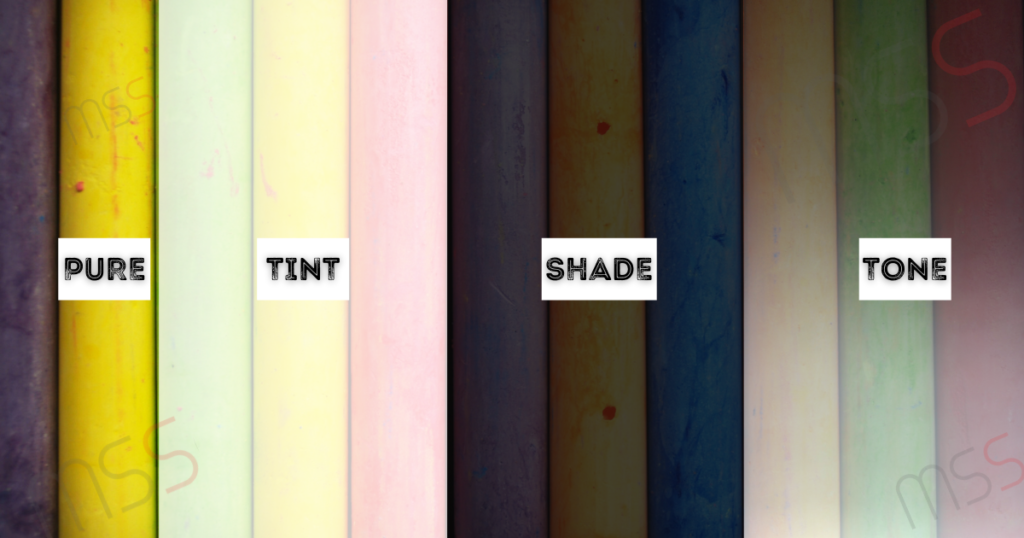
PURE COLOURS
Pure colours are also called as pastel colours. We can make 3 types of alterations to pure colours, they are
- TINT – Various levels of white when added to the Pure colours
- SHADE – Various levels of black when added to the Pure colours
- TONES – When mixture and multiple levels of black and white are added to the pure colours. Most times, since pure colours are of high intensity, we need to tone down these colours. In such scenario, various levels of white and black colours are added to tone it down.
COLOUR WHEEL

Normally the colours inside a colour wheel is classified into 2 segments.
- Warm Colours
- Cool Colours
Blue and Green colours are considered as the cool colours while Red and Yellow colours come under the warm colours.
Contrast is another aspect any marketing person should know while using colours. Contrast is a simple concept of knowing how one colour stands apart from another. High contract normally is used in icons and texts where they have to stand apart from the other parts of the image. Mostly the point of sales segment, the cost segments and the USP segments are mentioned in High Contrast so that those details are not missed by the customers.
Most people think and believe usage of two different colours means contrasting colours. Difference in colours doesn’t create contrasting effect. The best way to really understand about contrasting colours is to turn them to grey scale and then analyse them. Contrasting colours should stand widely apart in grey scale mapping. A combination of high and low scale contrast always works. Maybe low contrast for the background and high contrast to the text used is a great way to speaking out loud with your design.
LOGO
When you design a logo, make sure you follow maximum simplicity. A max of 2 to 3 colours are always good for a logo. And when It comes to Logo standards, you always need to work the placement of logo in black and white as well as single colours based on the placement. So it is always advisable to go simple and minimal colour variations.
When you use two colours in your logo, make sure you use complimentary colours. Complimentary colours mean opposite colours, it means colours that are directly opposite to each other in a colour wheel. Examples are Blue-Orange / Red-Green / Yellow-Purple etc
Human eyes always expect colours that are opposite for a visual break. Also you should keep in mind not to go for a 50-50 combination of colours. Always use the complimentary colours to depict the part you want to be highlighted or stand out. The portion of the logo or a poster you want maximum attention from your customers can be depicted using contrasting or complimentary colours. An example is when you design a banner which is mostly blue in colour, make sure to use the “Call for Action” button as Red or Orange.
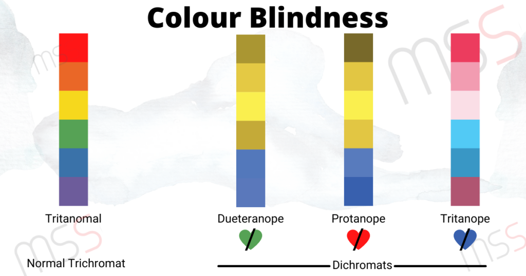
COLOUR BLINDNESS
A good marketing strategist should research and understand his/her target group to a very deeper level. Few of the target audience might be colour blind. This physical condition is to be considered when you design your logo. Let us see some of the common colour blindness conditions which will be helpful while choosing colour for your brand artworks
When using 3 colour combinations, split complimentary colours. That is, choose one colour as a base colour and two colours adjacent to its opposite colours in the colour wheel. For example, if you choose green as base colour, 2 adjacent colours to red, that is orange and red purple can be used.
Such colours are called Analogous colours, which means colours adjacent to each other and related. Monochromatic Colours are same colours with its tints, shades and tone variations.
After you learn about colours and the effective and psychological ways of usage, you need to know the psychology of colours in marketing.
- Colours impact on how we think and behave
- Colours direct us where to look, what to do and how to interpret
- Colours tell us what is important and what is not
- Colours are subjective from person to person
Let us now see the properties and psychological aspects of various colours in marketing. Ref: Mr.Lindsay Kolowich, hubspot.
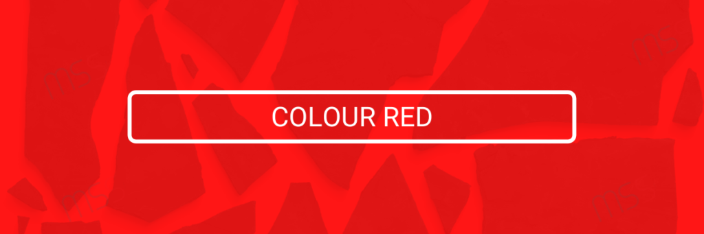
Red colour creates a sense of urgency. Hence this colour is always used in association with sales. Mostly all the point of sales button across websites and other marketing campaigns and advertisements are shown in red to create this send of urgency to buy the product or service.
This colour also encourages petite and hence used in most fast food chains. The colour also gets our human pulse raising and hence used in fast cars and lingerie business branding.
The positives of red are power, passion, energy, fearlessness and excitement.
The negatives of red shall include Anger, danger, warning, defiance, aggression and pain
Red is 7% favoured in men and 9% favoured in women audience.
Cheapness of a colour is a very important factor to be considered for brand positioning. As discussed earlier, a luxury brand should not use a “cheap” colour for its branding. Under this contact 9% of people consider red as a cheap and economically lesser valued colour.
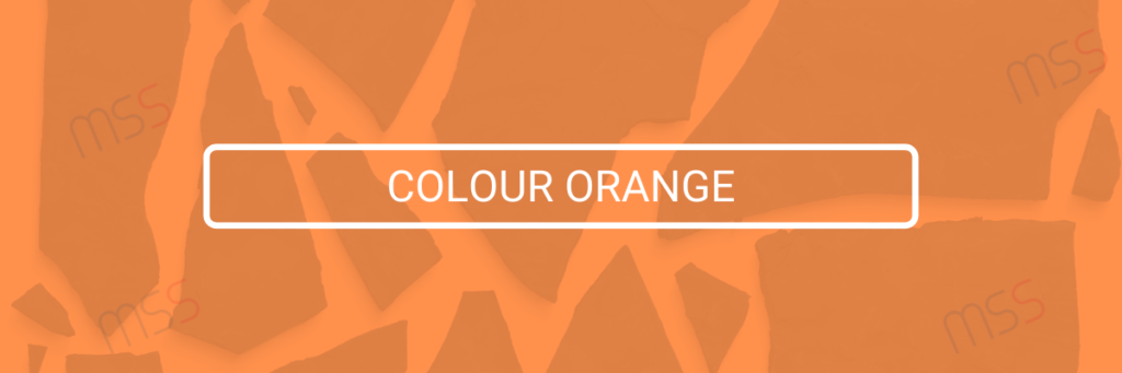
Orange is known for its warmth as it is always closely associated with the Sun. It is one of the colours which is considered as economically cheap colour. The positive attributed of orange are that it symbolises courage, confidence, warmth, innovation, friendliness, energy and many more. The negative attributes are depression, frustration, immaturity, ignorance, sluggishness.
5% of men favours orange while 22% of men dislikes this colour
5% of women favours orange while 33# dislikes it.
As mentioned, being considered as one of the cheap colours, 26% of the people across the world consider Orange as economically cheap.
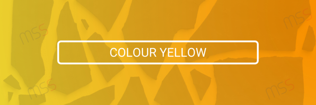
The colour yellow represents youthfulness, happiness, fun and sunshine. The positive attributes of yellow are optimism, warmth, happiness, creativity, intellect and many more. The negative aspects of the colour emphasises irrationality, fear, caution, anxiety, frustration, cowardice etc.
Taking its bright and friendly attribute, though a warm colour, yellow is also a favourite colour for both genders. 57% of men favours yellow while only 1% of men dislikes it. Meanwhile almost 35% of women favours yellow and 0% of women dislikes the colour.
Being very close with Orange, yellow is also considerably regarded as a cheap colour. 22% of people across the globe consider yellow as a economically cheap colour.
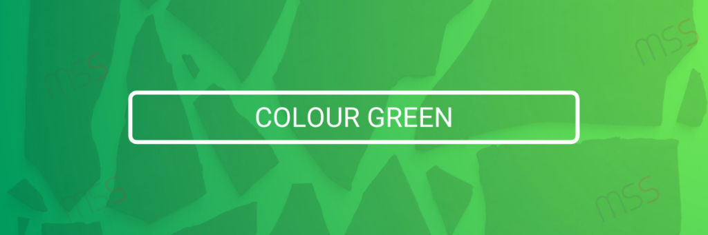
Green is a colour that is synonymous to health and wellbeing. This colour represents life. It symbolises balance, harmony and is the most seen colour of the nature, life, rest and peace. It is also the colour of wealth. It is because of these reasons, this colour is widely used in healthy brands from Pharma to organic food. As mentioned, this colour is linked to money, growth and power.
The positive attributed of green are health, hope, freshness, nature, growth and prosperity. The negative aspects are boredom, stagnation, Envy, Blandness etc.
14% of men favours green and 2% dislikes the colour. In the other hand, 14% of women likes it and 16% dislikes the colour.
6% of people consider this colour cheap.
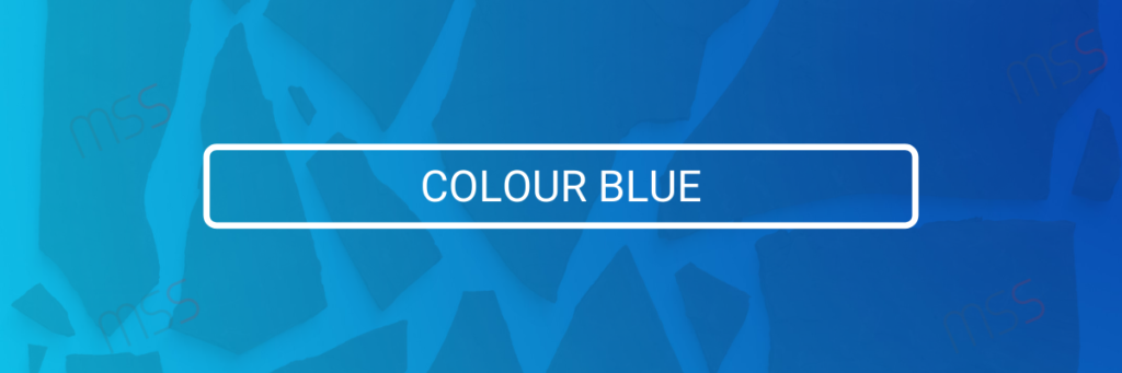
Blue is one of the most liked colours in the world. When red symbolises physical needs, blue related to the mental needs. Blue is one of the last colours to be seen and if used too much, it creates a feeling of distant, cold and unfriendliness.
Blue as a colour has a great calming effect. This colour is considered as a colour of strength, wisdom and trust. Blue suppresses appetite as there is no natural blue food in nature. The positive attributes of this colour are trust, loyalty, dependability, logic, serenity and security. The negative aspects are coldness, emotionless, unfriendliness, unappetising etc. Mostly used by workout facilities, Banks, Hospitals etc.
57% of men likes this colour while 1% dislikes it. 35% of women likes blue and 0% do not favour this.
Since this colour symbolises trust, only 1% of people consider this as an economically cheap colour.

Purple is a special colour that has the energy and power of red, stability and reliability of blue in a perfect balance. Purple is a colour of royalty and superiority throughout history. Prestigious brands targeting the creamy audience use purple. Purple commonly represents luxury, loyalty, courage, mystery and magic.
The positive attributes of purple are wisdom, wealth, spirituality, imagination, sophistication etc. The negative aspects of this colour are reflection, decadence, suppression, excess, moodiness etc
Though colour of luxury, on a common survey roughly 1% of men favoured purple and 22% disliked the colour. Meanwhile 23% of women favoured purple while only 8% disliking it. 4% of the general audience opted purple to be a cheap colour while this comment is widely criticised.
Pink is a softer, less intense version of red. Due to its compassion, unconditional love, caring and understanding attributes, this colour is the most widely used one to portray femininity. Pink can give youthfulness to a formal brand and is commonly used in baby products, bathroom products, lady products and skin care.
The positive attributes of Pink are imaginative, passionate, caring, creative, innovative, quirky etc. The negative aspects are outrageous, rebellious, flippancy, impulsiveness etc. When this colour is used too much, it also gives an immature appeal to the brand.
1% of men consider pink and 9% dislikes it. While 5% of women favours and 2% dislikes pink. 3% of people opted pink to be a cheap colour too.

Brown symbolises security and protection. It is basically a down to earth colour and is not widely used because of its reserved and boring nature. This colour can be seen mostly used in coffee shops and furniture shops owing to its relation to the product itself.
The colour gold is a variation of yellow and has different meanings depending on the culture. The colour signifies charm, confidence, luxury, treasure and mostly related to friendliness, abundance and prosperity. Too much usage of this colour can implicate egoistical and proudness.
This colour is mostly used in luxury products, trophies and jewellery.
Black is synonymous with luxury, power and control. Addition of a bright colour with black can add energy. This is a selective colour suited for certain industries and not others. The positive attributes of black are sophistication, security, power, elegance, authority and substance. The negative aspect is oppression, coldness, Evil and mourning.
5% of male audience prefers black and 4% dislikes it. While 6% of female audience favours this colour while 4% dislikes it. Being a colour of luxury again, only 1% of people consider this colour economically cheap.
The colour symbolises completeness, purity, innocence, cleanliness and peace. It is a colour of new ideas. This colour should be carefully used and it needs proper restraint in design. Poorly executed in design can cause the later to symbolise lazy and lack personality.
The positive attributes of this colour are innocence, purity, cleanliness, simplistic, pristine etc. The negative attributes are sterile, empty, plain, cautious and distant. 2% of men like this colour and 5% dislikes it. While 1% of women likes it and 3% dislikes the colour. 9% of the people consider this colour cheap. Commonly used in weddings, websites and hospitals.
COLOUR PSYCH
Faber Birren in his blog on colour psychology and colour therapy has in detail connected the various psychological aspects with the colours which can be an easy guide to marketing experts in choosing the right colours.
Trust – Blue, White, Green
Security – Blue, Black, Green
Speed – Red
Cheapness – Orange, Yellow, Brown
High Quality – Black, Blue
High Tech – Black, Blue, Grey
Reliability – Blue, Black
Courage – Purple, Red, Blue
Fear / Terror – Red, Black
Fun – Orange, Yellow, Purple
COLOURS BASED ON GENDER
This is another interesting segment to be considered. When a marketing person chooses a colour for a brand, it is important to know the right target audience. If the product or service offered is gender specific, then the colour should be selected based on the gender preferences. An interesting survey was done by kissmetrics blog on a gender based preference. Few points from the survey are
- Blue is the most favoured colour for men and women
- Men dislike brown the most and women dislike orange the most
- Colours mostly disliked were also seen as cheap colours
- Men tolerate shades of grey ( achromatic ) colour better
- Women prefers tints while men go with pure or shaded colours
- Cool colours were preferred by 56% of men and 76% of women
- Older age group of both genders disliked Orange and yellow
Women identify and see more colours than men. They are well aware of slight colour differences within a colour range. This simply shoes why men call blue as blue, while women use cerulean, sky, teal, turquoise and other varieties of blue. Men tolerate both colourless and bright colour palettes because of this less sensitivity to colours.
This shows that you need to check if your audience are men or women, what age they are at, your content if using the right colours or not etc. If your audience group is women, you should use your colours carefully. If selling a luxury product, don’t use colours that indicate cheapness.
According to institute of colour research, people make judgements about your content in 90 seconds or less. And upto 90% of the judgement in that brief amount of time is influenced by the colours they see.
According to blogger Neil Patel in Quicksprout.com, 85% of consumer base’s buying decision are on colour. Full colour ads in magazines get recognised 26% more than black and white ones. 85% of shoppers say that colour is the primary reason for them buying a product. 66% of people won’t buy certain appliances unless it comes in their preferred colour. 26% full colour ads in magazines get recognised than Black an white ads. Colour increases brand recognition by 80%. More than 90% of purchase decisions are influenced by visual factors. People make subconscious decisions after 90 second and 90% of the time, the product assessment is based on colour.
As said by Joshua Porter in hubspot, performable ( a marketing automation company that develops software for sales and marketing performance analysis ) made an analysis by using green colour and red colour on their “”Get Started Now” call for action button and the red button outperformed the green button by 21%. Means 21% more people clicked the red button than the green button.
So next time you think of a logo for your brand, a poster or any marketing campaigns, kindly keep all these in mind. All success to you and your business.